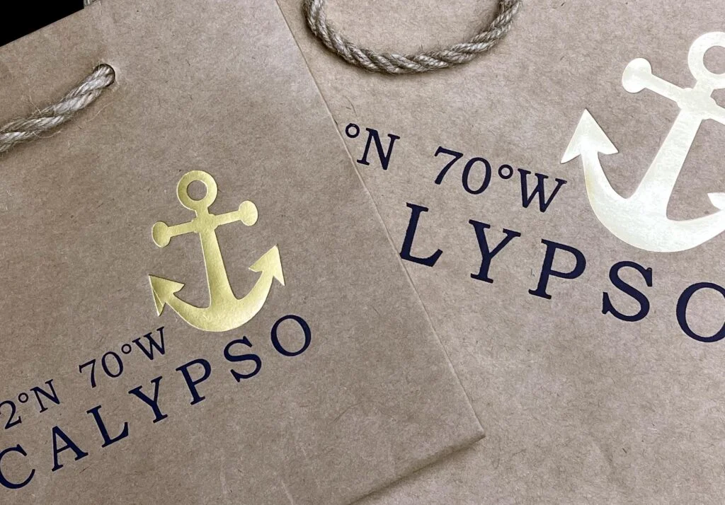
Custom packaging is a fantastic way to make your product stand out and elevate your brand. But what ties the whole package together? Your logo! That little design element does a lot of heavy lifting, so it’s important to get it right. Here are some tips to help you create the perfect logo for your custom packaging:
Brand Identity First
Before you even sketch a line, solidify your brand identity. What are your core values? Who is your target audience? Your logo should visually represent these things. Think about the emotions you want to evoke – is it playful and youthful, or sophisticated and luxurious?
Keep it Simple
Complexity can be the enemy on custom packaging. A logo with too many details might get lost in the printing process, especially on smaller boxes. Think about iconic logos like Nike’s swoosh or Apple’s apple – simple yet instantly recognizable.
Color Chemistry
Colors are powerful branding tools. Choose colors that complement each other and resonate with your brand identity. Consider how the logo colors will interact with the packaging color as well. A bright red logo might get lost on a red box, so you might need a contrasting shade.
Think in Multiple Dimensions
Custom packaging can come in all shapes and sizes. Make sure your logo looks good not just on a flat surface, but also on curves, folds, and different box sizes.
Printable Perfection
Not all designs translate well to print. Avoid gradients, super thin lines, and intricate details. Ask your printer about any specific requirements for file format and resolution to ensure a crisp, clean logo on your packaging.
Logo Variations
Consider creating a simplified version of your logo specifically for packaging. This might be a single color version of your main logo, or a logo without a tagline.
By following these tips, you can design a logo that perfectly complements your custom packaging and becomes a memorable ambassador for your brand. Remember, your logo is a visual first impression, so make it count!


